
Mastering Metal with Graphite and White Charcoal

Lessons
About This Lesson Series...
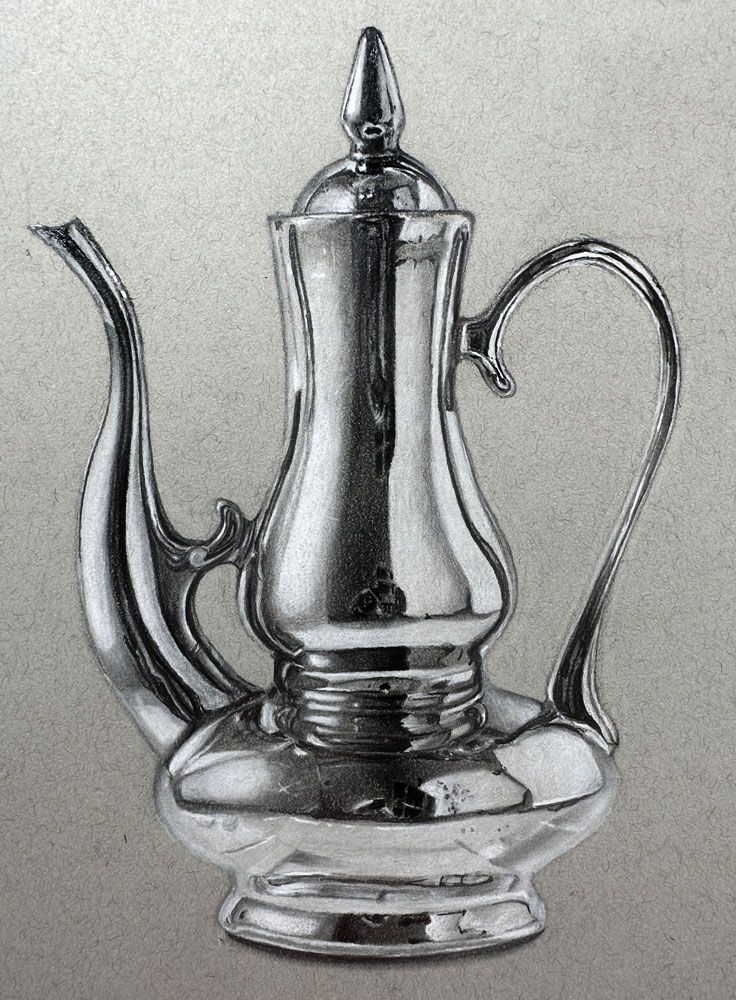
The Mastering Metal with Graphite and White Charcoal class is a comprehensive lesson series designed to teach artists how to realistically render metallic surfaces using a combination of graphite and white charcoal. This class focuses on observation, value control, and contrast to capture the reflective qualities and intricate details of metal objects. By the end of the lesson, you’ll have developed the skills to depict polished, textured, and dimensional metal with confidence and precision.
Understanding Light and Reflection
A key component of this class is learning how light interacts with metallic surfaces. You’ll explore how highlights, midtones, and deep shadows define the reflective nature of metal. The lesson explains how to analyze reflections, shine, and subtle tonal variations to convey the material convincingly. Understanding these principles is essential for creating depth and realism in your drawings.
Planning and Sketching the Composition
The class begins with planning and sketching the subject, emphasizing proportion, perspective, and overall composition. You’ll learn how to simplify complex metallic shapes into manageable forms while preserving accuracy. Establishing a clear and precise sketch ensures that subsequent layers of graphite and white charcoal can be applied effectively, laying the foundation for a realistic finished piece.
Building Values with Graphite
Once the sketch is complete, the lesson demonstrates how to build values using graphite pencils. You’ll learn techniques for layering different grades of graphite to achieve smooth gradients, subtle shading, and strong contrast. Emphasis is placed on controlling pressure, blending, and developing form, helping to create the illusion of three-dimensional metal surfaces.
Enhancing Highlights with White Charcoal
White charcoal is used to enhance highlights and create the reflective qualities that define metal. You’ll see how to selectively apply white charcoal to sharpen edges, emphasize reflections, and increase contrast against the darker graphite areas. This technique allows for precise control over the brightest spots, making the metal appear luminous and polished.
Capturing Texture and Detail
A significant focus of the class is rendering texture and fine details. You’ll learn how to depict scratches, dents, and surface variations that give metal its character. The instructor demonstrates how to balance intricate details with smooth reflective areas, ensuring the drawing maintains realism without becoming overly busy or cluttered.
Final Refinements
In the final stages, attention shifts to refining contrasts, adjusting edges, and unifying the composition. You’ll learn how to evaluate your drawing as a whole and make finishing touches that enhance the metallic effect. By the end of the lesson, your artwork will display polished, realistic metal with depth, reflection, and dimensionality.
A Complete Graphite and Charcoal Experience
By completing the Mastering Metal with Graphite and White Charcoal class, you’ll gain essential skills in observation, value control, layering, and highlight enhancement. The techniques taught in this lesson can be applied to a variety of subjects, from still life to industrial objects, providing a solid foundation for creating realistic, high-impact drawings with both graphite and white charcoal.
Specific Lessons
Materials and Contours: (8:04)
In lesson one, we discuss the materials and create a contour drawing of the metallic subject.
Top and Spout: (10:31)
In lesson two, we begin developing the value shapes and relationships, focusing on the top of the teapot and the spout.
Upper Body: (9:26)
In lesson three, we continue working down the middle of the picture plane, addressing the upper body of the teapot.
Lower Body: (11:34)
In lesson four, we address the middle and lower portion of the teapot.
Completing the Drawing: (10:46)
In lesson five, we complete the drawing by addressing the bottom of the teapot, the cast shadow, and the handle.
Resources for this Lesson...
Distributing any content downloaded from this site is strictly prohibited and against the terms and conditions of use.
References
Here's what you'll need...
- Strathmore Toned Gray Sketch Paper
- Graphite Pencils (H or HB, 2B, 6B)
- White Charcoal Pencil
- Vinyl Eraser
(Disclosure: Links to art materials are affiliate links which means we make a small commission if you purchase at no additional cost to you.)

Founder of The Virtual Instructor, artist and teacher. Matt makes learning art easy to understand and enjoyable.
Thanks for this course Matt! I can’t wait to give it a try although right now I am concentrating more on pastels. (This could also be done in pastels, so you never know, I might even try it!)
Thank you for this course. Was really helpful. It looks great.
This is such a clever way of breaking a drawing down into manageable pieces I am so impressed at what I have seen the past couple of days. I am on my trial membership at the moment, but so very pleased with what I have learned as a beginner so far. Thank you, it all makes so much sense so helpful.
Hi Patricia! Awesome to hear!
Just completed this lesson. Very happy with the result. Thank you for your terrific instructions!
Thanks Kevin! I’m glad you enjoyed it!
That was really amazing! And it worked (more or less)! Is there any chance to upload the result?
You could join the community forum and upload there. Many members upload and share results from classes.
https://community.thevirtualinstructor.com/
Hi Matt,
Questions:
1) What makes , say grey, a cold or warm grey?
2) I have a box of Prismacolor pencils and as long as I follow your lead I am ok. However, once I try something on my own, I have no clue as to what color to choose. Any exercise I could do to help my case?
I did the color wheel, and that helps big time but I am talking about so many nuances in the colors…
Btw, Your courses are excellent! I mean it. Nothing like it on line.
Thank you.
Thank you.
Hi Didier,
Warm grays lean towards brown, while cool grays lean towards blue. Here’s a lesson on warm and cool grays that may help…https://thevirtualinstructor.com/blog/warm-vs-cool-grays
When it comes to making color choices, experience is your best friend. Over time, you’ll get better at picking the colors that best match the subject. Even with experience, you’ll still encounter times when you’re not sure what color or colors to use. This is why I always have a test sheet of paper at the ready. I’ll test combinations of colors or pure colors before making marks on the final surface. Sometimes it takes several tries to find the right combination.
I watched the recommended video and it helps absolutely.
Thank you.
D.
Just out of curiosity, could this be done on black paper? It seems like it would really pop on black paper.
Hi Margaret,
Yes, you could work on black paper. If you do, I would suggest working with just the white charcoal and leave the graphite out. Allow the black of the paper to work for your darker values.