
Butterfly with Pastels

Lessons
About This Lesson Series...
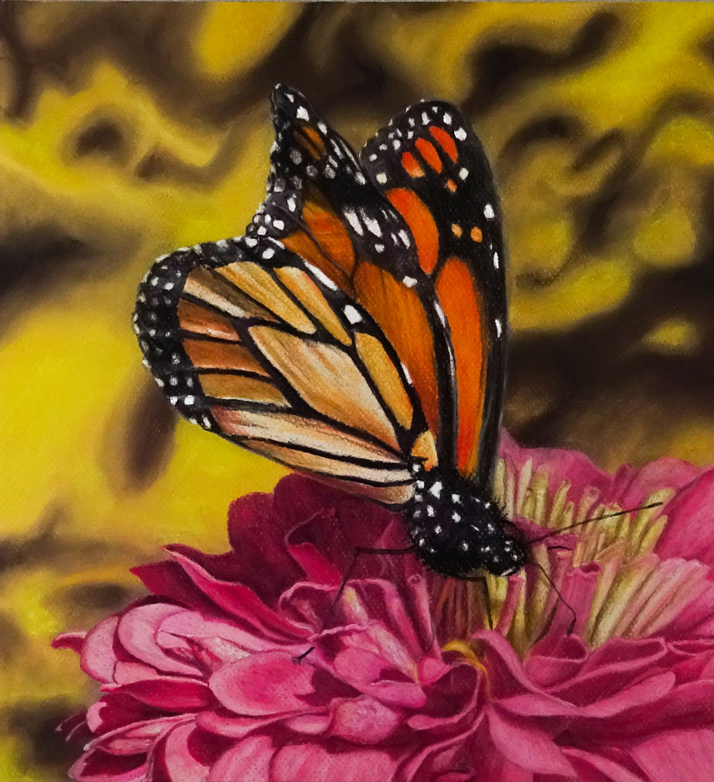
The Pastel Butterfly lesson series is an immersive and highly instructive exploration of creating a vibrant pastel drawing featuring a butterfly perched on a flower. Spanning multiple lessons, this series guides students through every stage of the pastel process — from initial observation and composition to layering, texture, and finishing touches. With soft pastels or pastel pencils on quality pastel paper, you’ll develop the ability to capture both the delicate beauty of your subject and the expressive potential of pastel as a medium.
Observation and Composition
The journey begins with careful observation of your subject, emphasizing shapes, relationships, and value transitions. Students learn how to study the butterfly’s wing patterns, the flower’s structure, and how light interacts with both forms. This early focus on observation helps you simplify complex shapes into manageable areas of tone and color — an essential skill for confidently building a successful pastel drawing. Establishing a thoughtful composition here ensures the final image feels balanced and engaging.
Preparing Materials and Surface
Before applying pigment, the series covers materials and surface preparation. You’ll learn about the types of pastel paper that work best for vibrant color and layering, how to tone your surface if necessary, and how to choose pastels or pastel pencils that support your desired effect. This foundation establishes a workflow that supports controlled application and helps you avoid common problems like chalky color or muddy transitions.
Blocking in Color and Value
Once your surface is prepared and your drawing mapped out, the series moves into blocking in broad areas of color and value. Students begin laying down basic tones for the butterfly’s wings and the flower petals, focusing on local color and value relationships rather than details. This stage allows you to feel comfortable with color placement and helps ensure that the underlying structure is accurate before refining individual features.
Developing Color and Gradation
As the drawing progresses, attention shifts to developing richer color and smoother gradations. You’ll learn techniques for layering pastel — how to build color gradually, how to adjust pressure for subtle transitions, and how to blend effectively to create luminous areas of tone. Layering techniques help strengthen form and depth, giving the butterfly and flower dimension and presence. This process also reinforces how color temperature and contrast guide the viewer’s eye through the composition.
Texture and Detail Work
A major focus of the series is capturing the intricate textures that make the subject feel alive. Students explore how to suggest the fine patterns on the butterfly’s wings, the soft textures of petals, and the delicate play of light and shadow across surfaces. Whether using soft pastels for broad color or pastel pencils for refined mark-making, the lessons demonstrate how to balance detail with expressive color to achieve a compelling visual effect.
Refining and Finishing Touches
In the final stage of the series, students concentrate on refinement and polishing the overall drawing. This includes enhancing contrasts, strengthening focal points, and adjusting edges to unify the piece. You’ll learn how to evaluate the artwork as a whole, making subtle adjustments that increase harmony and depth. These finishing touches help ensure that the butterfly on its flower feels vivid, dimensional, and fully resolved.
A Complete Pastel Experience
By the end of the Pastel Butterfly lesson series, you’ll have created a beautiful pastel drawing that demonstrates your growing mastery of color, texture, and observation. The skills learned — from planning and layering to detail and refinement — are widely applicable to future pastel projects, giving you both technique and confidence as you continue your artistic journey.
Here's what you'll need...
- Soft Pastels
- Pastel Pencils
- Toned Pastel Paper
- Kneaded eraser (optional)

Founder of The Virtual Instructor, artist and teacher. Matt makes learning art easy to understand and enjoyable.
Hi Matt, how do you get rid of the dust? How do you prevent areas from being contaminated by pastel dust? Thank a lot!
If I consent to the one year subscription will the money be deducted as one payment or will it deducted per month
Hi Collen,
The yearly subscription is deducted once a year for the full amount. In the future, you may consider using the contact form or emailing directly for questions concerning your account.
Hi Matt, I just have a quick question about your next course. Since you have completed your most recent course “25 days to better drawings” course; are you going to ask us to vote for your next course soon?
Thanks,
Best,
**Nikki**
Hi Nikki,
Absolutely! Voting will begin soon when I have the list of ideas for the next course. Voting should begin sometime next week.
I’m confused….did we skip a lesson last Thursday? And was there a lesson on Tuesday ( yesterday)?
Hi Barbara,
We’re currently having network issues with services that are coming into the studio. Without going into too many boring details, the issues are all external, meaning new wiring and equipment must be installed in this area (in the surrounding areas outside of the studio). The issues are unfortunately out of our control. We thought that the issues that began last Thursday would be resolved by Tuesday (so we could do the live stream) but instead they were actually made worse by the technicians working the job! As a result, we were forced to cancel the stream on Tuesday. We are still having these issues at the time of this writing, but hopefully they will be fully resolved today in time for the next scheduled lesson on Thursday.
Believe me, I am incredibly frustrated by this and I apologize for the inconvenience.
Matt, we’ve missed you but patiently wait for you to get back on line. I know this must be terribly frustrating for you and we want you to know that we completely understand that it is out of your control.
You are an amazing teacher and artist. We appreciate all that you do to help us enjoy the talents that we all have.
Thanks so much Max! All services have been restored and I’m looking forward to continuing with this series!
Thanks for your reply, Matt. I’m sure this situation is very frustrating for you and I hope the problem is resolved soon. No need for an apology! 🙂 Since I am 6 time zones into your future I always look forward to the uploaded videos and I was afraid that I had somehow missed them.
Looking forward to resuming the lessons 🙂
Hi Barbara, Thanks for that! Everything is back to “normal”. 😉
S
Hi Matt, sorry about the above comment! I accidentally pressed enter and now I can’t delete it lol
Now, my question ….. I was wondering if you can do more live lessons of “basic drawing exercises”? It’s been awhile since you did one of those …..
Thanks, 🙂
**Nikki**
Hi Matt,
Lesson Seven – The download options are not displayed correctly, could not download it. Please fix it.
Thanks
Hi Ashis,
This has been fixed. The video was just uploaded when you tried to download it. It takes a little while to process the download files and make them available.
Loving this so far, currently at lesson 7, but am eager to know how many more lessons there will be for this as I hoped to finish in time for a birthday rapidly approaching.
I would like to know…..
Hi Matt! Really enjoying these lessons. Right now I’m just watching to get the overall idea of how this is worked before I actually try it out. I don’t have the Conte pencils, so I would like to know what color numbers you are using on the flower and on the butterfly. Hopefully I can purchase them open stock and be ready to join you! Thank you!!
My Rembrandt stick pastels come in a base number, ie Gold Ochre 231.5 . The 231.3 (there can be a .2 also.. deeper than .3) has some black. The 231.7 thru 231.9 are increasing lighter value tints. That is why Matt appeared to have two different colors for Gold Ochre. I was confused so I pulled out my color charts for my Rembrandts. My columns were separate color designations (Gold Ochre, Burnt Sienna, Ulltramarine Blue, etc.) and the rows were .2, .3, .5, .7, .8, & .9 (.5 being the straight index color). The Conte a’ Paris pastel pencils are numbered like most colored pencils are.
Derwent makes a holder you can place the pencil in while you sharpen it with a craft knife. I bought one on Amazon and it is very useful at keeping the pencil stable.
Hi Matt, this is the first live lesson I’ve watched and am loving it! You make it all seem so less intimidating by saying you don’t have to stick ridgidly to the reference. Also love it all being real time to watch every process, and having the reference on screen the whole time really helps. I’ve just started using pastels and am loving the effects, especially the blending. Your commentary is great. You make me laugh. I’m so glad I became a member. It’s great to see you work and realise that there’s no rush to produce a piece. You’ve helped me to take the pressure off myself. Thanks!
Thanks Chris!!!
I’ve just watched video 2 and I love the slow pace and the time you’re taking. It’s making me learn and is also relaxing to watch so not boring at all!! Also I’m in the uk so will watch these when not live. So glad they’re all saved. Am learning so much, Matt! Thanks again!
So glad you made the changes to the composition so we could watch how and what you did – so helpful! Have just bought some conte a Paris pastel pencils and I love them! Loving these videos of the butterfly! I’m learning so much each time I watch:)