
Architectural Detail with Markers
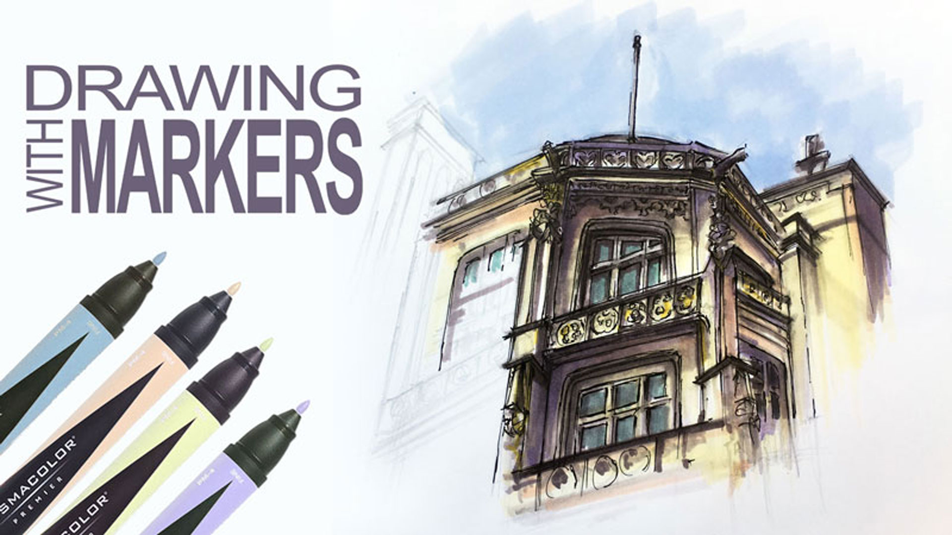

About This Lesson Series...
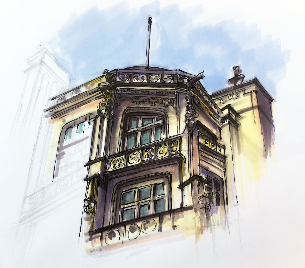
In this focused and engaging lesson series, Matt guides students through the creation of a detailed architectural sketch using alcohol-based markers combined with pen and ink. Designed as an accessible introduction to marker techniques, this class demonstrates how to effectively blend structure, value, and color into a cohesive drawing. By working through the rendering of an architectural detail, students gain practical experience with a versatile mixed-media approach that balances precision with expressive mark-making.
Getting Started with Marker Techniques
The lesson begins with an introduction to working with alcohol-based markers, a medium known for its smooth application and vibrant color. Students explore foundational techniques, including how to control value using grayscale markers and how to apply tones evenly across the surface. This early stage emphasizes the concept of creating an “underpainting” with neutral tones—an approach that establishes the structure of light and shadow before introducing color.
By focusing on value first, students develop a stronger understanding of form, making it easier to achieve depth and realism in later stages of the drawing.
Building Structure Through Simple Forms
Before diving into complex details, Matt demonstrates how to break down the architectural subject into basic shapes and forms. This simplification allows students to map out the composition with confidence and accuracy. Using a light graphite sketch as a guide, the major elements of the structure are placed carefully on the page, ensuring proper proportions and alignment.
This step is essential when working with architectural subjects, where clean edges and accurate relationships between forms contribute to a convincing final result.
Defining Details with Pen and Ink
Once the foundational shapes and values are established, pen and ink are introduced to refine the drawing. Students learn how to use drawing pens to define edges, enhance contrast, and add intricate details to the architectural elements. This stage brings clarity and structure to the image, allowing the linear qualities of the subject to stand out.
Matt demonstrates how to use line weight and selective detail to guide the viewer’s eye, ensuring that the most important areas receive the greatest emphasis. This balance between detail and simplification is key to creating an engaging and readable composition.
Layering Color with Markers
With the ink work in place, color is gradually layered over the drawing using markers. Students learn how to apply transparent layers of color over the established values, allowing the underpainting to show through and influence the final appearance.
This process creates rich, dimensional color while maintaining the integrity of the original drawing. By working in layers, students can build intensity slowly and make adjustments as needed, resulting in a more controlled and polished outcome.
Combining Precision and Expression
Throughout the lesson, emphasis is placed on the relationship between precision and spontaneity. The pen and ink provide structure and definition, while the markers introduce fluidity and expressive color. This combination allows students to create artwork that feels both controlled and dynamic.
Students also gain insight into how to make decisions about where to push contrast, where to soften edges, and how to unify the composition as a whole.
Build Confidence with Markers and Mixed Media
This lesson series is ideal for artists looking to explore markers as a primary medium or to incorporate them into their existing workflow. With clear instruction and a logical progression, Matt makes the process approachable for beginners while still offering valuable insights for more experienced artists.
By the end of the class, students will have completed a detailed architectural drawing and developed a strong understanding of how to combine markers and pen and ink into a cohesive and effective mixed-media technique.
Here's what you'll need...
- Alcohol-Based Markers
- Ink Pens
- Marker Paper
- Graphite Pencil

Founder of The Virtual Instructor, artist and teacher. Matt makes learning art easy to understand and enjoyable.
Went through this exercise today. I have a full set of Spectrum Noir markers and have used them a bit. Just felt like I was capping and uncapping constantly, trying to find just right color *and* value. VERY helpful to learn how to do an “underpainting” in just the grays. THEN apply the color. I also did the Skull alcohol marker exercise that the newsletter link led me to. Cant wait to try lesson to & finish the Biltmore picture!!
Just now finished Lesson 2. I NEED MORE EXERCISES! 🙂 These 2 lessons & the skull exercise have made me glad I bought all these markers! With these techniques you show us, Matt, I can do the style of art *I* like to do–more realism or abstract. I was worried these markers were good only for manga or pop art or whatever those illustration styles are called. They’re growing on me, but it’s not what I prefer to draw at the moment. Please let me know any suggestions you have for other subjects to try drawing using the “underpainting” with colors overlain. Or can you provide any pictures or links to images you think might be good to try? Thanks!!
Does drawing over other colors mess up the marker tips?
Hi Ava,
No. They are designed to be layered. You can layer to your heart’s content without fear of destroying the marker!
Hi Matt,
Finally took the plunge and subscribed to your website 🙂
I was very interested in this application/medium, and I was trying to source the ones used in the video, but being in Australia, I’m not sure that I can.
I have looked up a few Art supply shops in my vicinity and they appear to stock the ‘Winsor & Newton’ – Brush Marker, Pro Marker, and WC Markers. Will these be sufficient? Does it matter which one? They also have a Copic Mulitliner Fineliner available. Will this be a good place to start?
Thanks so much for your advice.
Merrin.
Hi Merrin,
You’ll want to look for alcohol-based markers. The Brush Marker line by Winsor and Newton is alchohol-based, so it should do the trick.
How do you like the 72 marker set? Is there a reason why you like Prismacolor markers more than the other brands?
Hi Ava,
72 colors in any medium is plenty. I do like the set, especially the variety in the “grays” which is probably what colors I use more than the others. I have been a Prismacolor fan for decades, so that’s why I opt for them – but there are other brands out there that may be better. For example, the Copic markers are very popular and feature a brush tip.
Thank you for answering my questions!
Hello Matt, I love this lesson – urban sketching style. I went for a walk in the Prague city old town yesterday, I tried to sketch building similar to this one. I had no idea about three point perspective, so this video is very helpful for me now, I can improve my sketch from yesterday! Thank you!
Hello Matt,
I came back to rematch this since I was going to do a project with markers and the second lesson with the markers is no longer here.
Is it no longer going to be here? Is it just my computer? I was hoping to gleam some techniques from this lesson.
Thank you Matt and greetings to your family.. I’ll come back to see what you say,
Teri
Oh no Matt, I apologize. It was just in hiding the second part. I’ve not been doing well and was not thinking straight though on my computer the second lesson seemed to be hidden.
I hope this did not take any of your precious time.
Teri