
Train with Line and Wash

Lessons
About This Lesson Series...
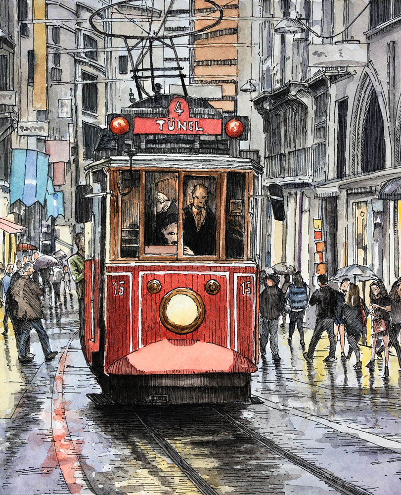
The Line and Wash: Train lesson series is an extensive mixed-media art project that teaches students how to combine detailed pen and ink drawing with atmospheric watercolor washes to create a lively street scene featuring a train on a rainy day. This multi-lesson series walks you through the complete process—from planning and drawing contours to finishing with watercolor and figures—over approximately seven hours of instruction. The combination of precise ink work and expressive watercolor washes produces a finished image that feels both structured and full of life.
Lesson 1: Sketching the Contours
The first lesson focuses on laying the groundwork for the entire project. Using a graphite pencil, students lightly sketch the scene’s basic contours, paying close attention to composition and perspective. This initial drawing establishes the train, surrounding architecture, and street layout in proportion so that later layers of ink and watercolor can be applied with confidence.
Lessons 2 & 3: Applying Pen and Ink
In the second and third lessons, students begin applying pen and ink to the train and foreground elements. Technical drawing pens or nib pens are used to build precise line work that defines form, structure, and texture. Hatching and cross-hatching techniques help create value and depth, while cast shadows under the train start to anchor the subject within the scene.
Lesson 4: Background Pen and Ink
The fourth lesson extends ink work into the background, weaving architectural lines, street elements, and textural details into the composition. This stage helps unify the foreground and background, ensuring the architectural rhythm and perspective support the overall narrative of the rainy street scene.
Lessons 5 & 6: Watercolor Washes
Once the ink drawing is complete, the series transitions into color with the addition of watercolor washes. In lesson five, students begin with light, transparent layers that establish atmospheric conditions and hint at rain-washed surfaces. Continuing in lesson six, washes are layered and refined, bringing life to the train, street, and reflections in wet surfaces. The watercolor work softens some of the ink’s linear precision and adds mood and depth to the piece.
Lesson 7: Final Details and Figures
The final lesson focuses on finishing touches and adding people in front of buildings, which adds narrative and scale to the scene. Students learn how to integrate figures without disrupting the established harmony of ink and wash, ensuring that human presence enhances rather than distracts from the overall composition.
A Complete Mixed-Media Experience
By the end of the Line and Wash: Train lesson series, students will have created a dynamic, atmospheric urban scene that combines the precision of pen and ink with the fluid expressiveness of watercolor. This project teaches not only technical skills but also how to think about narrative, light, mood, and harmony in mixed-media artwork, providing a rich learning experience for artists at many skill levels.
Resources for this Lesson...
Distributing any content downloaded from this site is strictly prohibited and against the terms and conditions of use.
References
Here's what you'll need...
- Graphite Pencil (H)
- 140 lb Hot Press Watercolor Paper
- Technical Drawing Pens or Nib Pens
- Kneaded Eraser
- Watercolor Paints
- Nylon Brushes
- Gouache (optional)

Founder of The Virtual Instructor, artist and teacher. Matt makes learning art easy to understand and enjoyable.
I’m so happy you decided to draw a train. Synchronically I had picked an image of a train to draw… I prefer your image and can’t wait to get started. Thank you!
Matt, for lesson 3, did you mean to write July 8th (Wednesday), or is it July 9th?
It should be July 8 – I’ve made the change.
Matt, can you spell the name of the pens you’ll be using? Thanks
Hi Peter,
The name of the pens I’m using are by “Staedtler”.
Matt, would you use this approach if you were to use colored markers or with water color pencils? I don’t have any water colors yet.
Hi Peter,
No, the approach would be different for colored pencils and watercolor pencils. I wouldn’t use any ink for colored pencils or watercolor pencils. I would apply these mediums directly in layers and skip pen and ink applications all together.
I think this stand on it’s own as just ink drawing I really like it. One other thing I wanted to ask and that’s whether or not you do any digital in Photoshop or other apps? I’m full of questions today!
Hi Peter,
Yes, I agree. You could push this drawing just a little more and it would definitely work as a pen and ink drawing. We have a few lessons on Photoshop and other apps. There is the course, “Basic Photoshop for Artists” and then there are a few lessons here..https://thevirtualinstructor.com/digital-painting-tutorials.html
I hope this helps.
I am watching this a bit late, but this live stream, video, whatever you want to call it was amazing! I sat and watched through the whole thing without getting up. It was pretty cool!
Matt, I noticed that the video download isn’t available anymore, was there a problem? Just curious!
Hi Peter,
The download links have unfortunately been removed. We had no choice but to do so since this feature was being abused. You can learn more about why we made this difficult decision here..https://thevirtualinstructor.com/members/removal-of-download-links/
I figured it might be reason #3. A few bad apples ruin it for the rest of us. I appreciated the ability to download because I set up a little room in the back of the house to draw and I don’t have internet back there and the laptop I’m using is very old and doesn’t have wi-fi. I’ll figure something out. Thanks!
Matt, I’m thinking of dipping my toes in watercolor and I wanted to know what the difference is between the Windsor Newton Pro and what they call Cotman color?
Hi Peter,
There is a difference. I have found the Cotman watercolors to be of high quality, however some colors seem a little too bright. I guess the best way to describe it is that some colors in the Cotman line seem less natural than those in the Pro line. I use both product lines and have found success with both. The Cotman colors just need a little more layering and perhaps some muting before looking natural.
Thanks Matt! It sounds like a new video perhaps.
Hi there. I teach little kids, and when I draw with them online, I sometimes do 2 at a time showing them how to draw lightly but also drawing darker just so they can see better.
Hi Matt, I hate to bother you again but you mention you will be using Stonehedge paper what brand do you use and what is stonehedgr paper. Does it come in different weights?
I want to get ready for the next live session and hopefully catch it live for a change.
Thanks again for your support.
I once heard that if you mix the same amount of Complementary colors, you will get grey.is this right?
hi