
Woodland Landscape with Oil Pastels

About This Lesson Series...
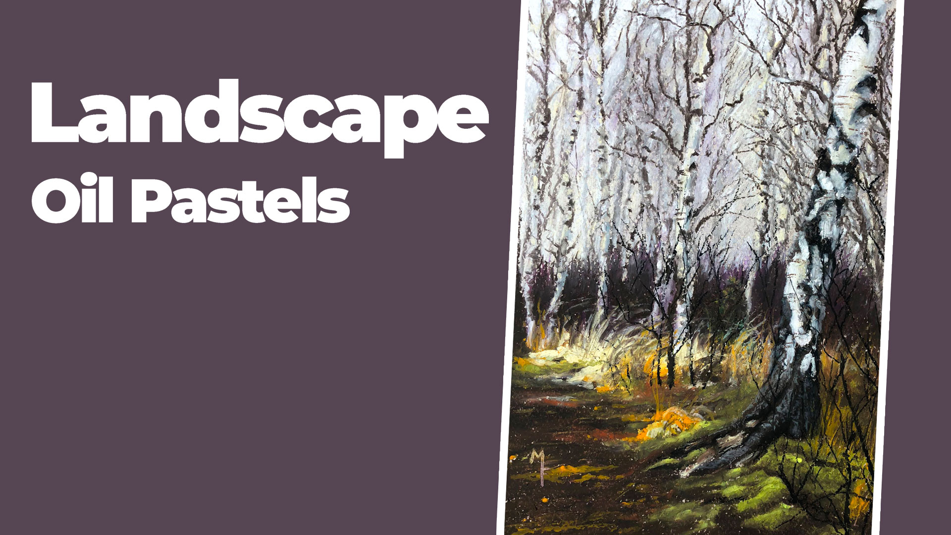
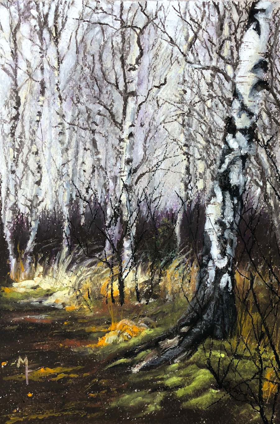
This lesson series is an immersive, multi-part exploration of how to create a vibrant woodland landscape using oil pastels on quality Canson Mi-Tientes pastel paper. Across four full lessons totaling over four hours of instruction, this series teaches both technical skills and artistic decision-making as you build a forest scene from background to foreground. Whether you’re new to oil pastels or looking to deepen your understanding of how this medium behaves in landscape work, this series offers clear demonstrations, thoughtful commentary, and practical strategies that help you build confident marks and expressive color transitions.
Planning and Establishing the Background
The series begins by focusing on establishing the background of the woodland scene. Early in the process, you’ll learn how to choose and apply color to suggest sky, light, and distant foliage, laying down a foundation that supports the rest of the composition. Understanding how far-away elements sit in the scene and how to create a sense of atmospheric depth sets the tone for the entire drawing. As you work, the instructor demonstrates how layering oil pastels in broad areas builds both value and mood, helping you see how light and shadow define space in a landscape.
Developing the Middle Ground
Once the background is in place, the lesson series transitions into developing the middle ground. Here, you’ll learn how to introduce more defined elements of the woodland — tree trunks, branches, and suggested foliage masses — with layered applications of pastel. This stage emphasizes how to refine color choices and build stronger shapes that suggest depth without sacrificing the harmony established in earlier layers. Techniques such as contrast adjustment and thoughtful placement of midrange tones help bring structure and rhythm to the forest setting.
Working Toward the Foreground
As the woodland landscape evolves, the focus shifts toward the foreground, where greater detail and stronger color work help anchor the scene. Students learn how to push values and saturation to create a sense of proximity and visual interest. Applying oil pastels with increasing intention, you begin to define overlapping forms, richer shadows, and more nuanced color transitions. The instructor’s step-by-step approach helps you see how layering pigment can suggest texture and lushness, enhancing the illusion of walking into the landscape.
Finishing Touches and Cohesion
In the final segment of the series, you’ll add finishing touches that bring the woodland scene together as a cohesive whole. Here the emphasis is on refining contrasts, clarifying edges where needed, and balancing values so that light, shadow, and color relationships feel natural and unified. The instructor offers guidance on evaluating your work as a whole, making subtle shifts that ensure a polished and visually compelling result. By the end of the fourth lesson, you’ll have completed a richly layered and expressive oil pastel landscape that reflects both technical growth and personal artistic voice.
Learning Through Process
Throughout the lesson series, the focus is not just on the final image, but on understanding why certain decisions are made, how color interacts in layered applications, and how to use oil pastels in a way that feels painterly and intentional. With clear demonstrations and practical insights, this series enhances both your skill set and your confidence in working with oil pastels for landscape subject matter.
Here's what you'll need...
- Oil pastels
- Canon Mi-Teintes pastel paper

Founder of The Virtual Instructor, artist and teacher. Matt makes learning art easy to understand and enjoyable.
Very nice. I really enjoyed the strokes with the white and grey in the background. I loved it just the way it was. LOL! But, the branches and trees on top of it are nice, too. I can’t wait until the live lessons go back to Thursdays. 🙂
Hi Ginny,
I’m sure we’ll go back to Thursdays again in the future.
Comments! woo woo woo!I’d be really happy to Thursdays We miss yall.
Hi Matt! Absolutely loved the color theory live lesson. Yes, please invite Ashley again – you guys were a great tag team! While watching this Oil pastel lesson, I was wondering if you had ever considered taking a reference subject such as this forest scene and doing a series of live lessons with each medium, using the same photo reference. It could be a great way to appreciate the differences between each medium and provide a comparison between them. We don’t begin the same way in building up our image or colors from one medium to the other (watercolor, dry pastels, oil pastels, colored pencils – they all have their own sets of rules). I think it would be interesting – especially for newbies – to see the evolution of an identical subject using each different medium. I realize that this could be a lengthy process, so I suppose a simple and smaller image would still allow to showcase each different medium. What do you think?
I think is a good idea! That would certainly be interesting and possibly encouraging for those who are using a different medium, getting a different result, and getting discouraged.
What a great idea! This sounds like a course to me!
I vote yea!
I like this idea because I often go back and forth with different medium.
I like the idea too. In fact, some time after Matt critiqued my acrylic painting of the monarch butterfly in the field, I re-cropped the photo reference (as he suggested in the critique) and “painted” it with pastels. I needed a time lapse between the pieces so I could look at the reference afresh but it was fun and I learned from it. It would be fascinating to see how different mediums might capture the same image – when done by someone who knows what they are doing!
Are you up for it, Matt? Perhaps this could be an idea for another course…
Boy, you guys are good! What a great idea! This is something I’ll consider as a course most likely.
I like that idea also
Thanks for your reply Matt. I am looking forward to seeing your take on this.
I like this idea, because when I saw this reference photo, I thought, “Hey, this may be a good subject to try my new Graphitint pencils on! May have to also use some watercolor, but I think most can be done with Graphitint.
Hi Matt I loved this lesson. I’m blown away so far and we just started. I’m back after 11 months of illness. Due to circumstances I’m still a beginner. This lesson is way above my pay grade – meaning I’m still in the graphite world. And may well be for the foreseeable future. I love your lessons. This is so kool and something to look forward to. It is now Feb 13th 2019. A lot to do. Keep the learning coming……….
A book I have suggests cooling the surface of the image with an ice pack (covered with a towel of course) before covering a previous color application with another when you don’t want the underlying color to show through.
Love the courses, thanks
I finished the first lesson and the process was quite enjoyable. Of course this is the first art class I have taken for over 25 years so it doesn’t look great. Regardless I am tell myself to continue on. Thanks, Matt.
Hi Matt,
I am new to oil pastel and am so happy for this wonderful lesson of this lovely scenery. As always, your artistic choices do make your art work unique and this scenery is no exception.
Another voter for a course in drawing/painting the same subject with different medias!
Thank you for being the teacher, who you are!
Buddy